Technical Topic Tuesday Day 27
Last week, we explored the histogram plots. This week let's explore next distribution plot - "Density Plot"
Density Plot
What is Density Plot?
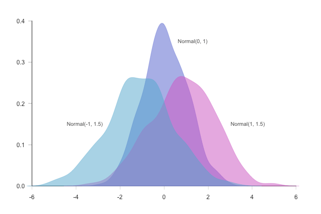
A density plot is a representation of the distribution of a numeric variable. It uses a kernel density estimate to show the probability density function of the variable (see more). It is a smoothed version of the histogram and is used in the same concept. Read More Here ..
Purpose of Density Plot?
Density plots are used to study the distribution of one or a few variables. Checking the distribution of your variables one by one is probably the first task you should do when you get a new dataset. It delivers a good quantity of information.
Density Plots in Data Science?
When analyzing data, you often need to study the characteristics of a single group of numbers, observations, or measurements. You might want to know the center and the spread about this central value. You might want to investigate extreme values (referred to as outliers) or study the distribution or pattern of the data values. Several plots are available to allow you to study the distribution. Read More Here ..
Which libraries are used in Python to plot the Density?
- Matplotlib and Seaborn Read More Here ..
- Plotly Read More Here ..
- ggplot [Which is derived by R now as ggplot2] Read More Here
- pygal Read More Here ..
Which libraries are used in R to plot Histogram?
- ggplot2 Read More Here .. [Packages used are "Histogram" and "Histogram Tools" from CRAN]
How does it look?

Next week, we will list down the points for next distribution plot in the list. Let me know if you have anything to share, I will include it in the blog post with your credit :-)
Happy Learning and Sharing!
