Technical Topic Tuesday Day 26
Last week, I asked the questions about distribution plots in Python and R.
Let's explore, the first distribution plot in the list, which everybody knows and simple to understand.
Histogram Plot
What is Histogram?
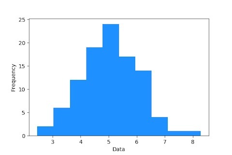
A plot that lets us discover, and show, the underlying frequency distribution (shape) of a set of continuous data.
Purpose of Histogram?
The purpose of a histogram is to graphically summarize the distribution of a univariate data set. (Univariate means "one variable" (one type of data). Example: You weigh the pups and get these results: 2.5, 3.5, 3.3, 3.1, 2.6, 3.6, 2.4. The "one variable" is Puppy Weight. If you have two sets of data, such as ice cream sales vs temperature, it is called "Bivariate Data". A numerical univariate data is discrete if the set of all possible values is finite or countably infinite. Discrete univariate data are usually associated with counting (such as the number of books read by a person). A numerical univariate data is continuous if the set of all possible values is an interval of numbers.) Read More Here ..
Histogram in Data Science?
Histograms depict the underlying frequency of a set of discrete or continuous data that are measured on an interval scale. This depiction makes it easy to visualize the underlying distribution of the dataset, and inspect for other properties such as skewness and kurtosis. Read More Here ..
Which libraries are used in Python to plot the Histogram?
- Matplotlib and Seaborn Read More Here ..
- Plotly Read More Here ..
- ggplot [Which is derived by R now as ggplot2] Read More Here
- pygal Read More Here ..
Which libraries are used in R to plot Histogram?
- ggplot2 Read More Here .. [Packages used are "Histogram" and "Histogram Tools" from CRAN]
How does it look?

Next week, we will list down the points for next distribution plot in the list. Let me know if you have anything to share, I will include it in the blog post with your credit :-)
Happy Learning and Sharing!
